-
Architects: Davidson Rafailidis
- Year: 2020
-
Photographs:Florian Holzherr
Text description provided by the architects. Built in approximately 1900 with a 1940s extension, the historic structure has operated as a grocery store, strip club, attorney’s office, and hair salon, among other businesses, in its past.
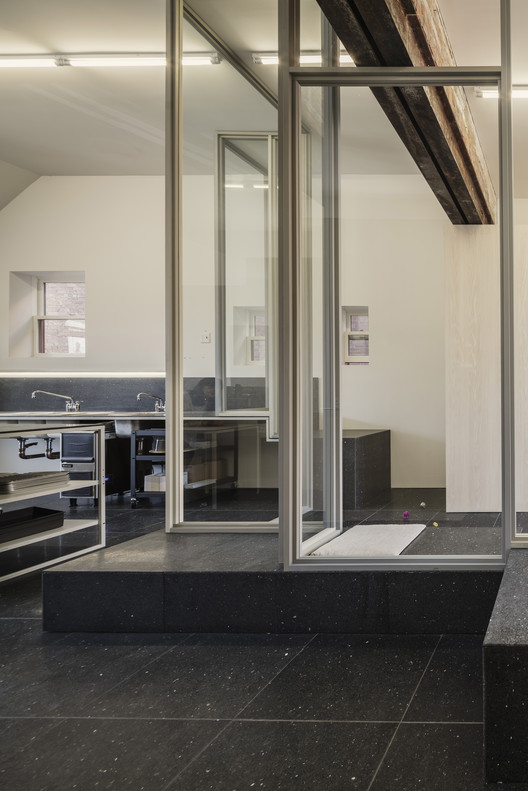
Davidson Rafailidis received a brief to transform the space into a cat café for a local entrepreneur, Buckminster’s Cat Café. Cat cafés offer a unique typology, given health regulations that demand an air-tight separation between animals and food preparation—in this case, cats and coffee. This requirement allowed Davidson Rafailidis to expand on the studio’s interest in designing partitioned spaces that support programmatic flexibility but still imply and encourage togetherness and community. The project, which the studio has called Together Apart, is the first phase of a continual construction scheme on the overarching lot, which responds to new city zoning that encourages high-density construction and furthers Davidson Rafailidis’ efforts to design heterogeneous, mixed-use spaces that service a wide range of users.
While Davidson Rafailidis’ design currently resolves as a cat café, it could easily accommodate other dualistic scenarios where division is necessary but not absolute, such as spaces for laptop/non-laptop use, music/quiet, smoking/non-smoking, and the timely situation of COVID antibody carriers and non-antibody carriers. “We are interested in connecting activities that are otherwise problematic to come together,” says Stephanie Davidson, co-principal of Davidson Rafailidis.
Davidson Rafailidis emphasized the ethos of Together Apart with a layout and design scheme characterized by a combination of separations, slices, and overlaps. “While there is a physical separation satisfying the health code, it is just one of many sliced, mismatched, misaligned, and mirrored elements in the space,” says Davidson. The building can be accessed from either end, allowing an independent functioning of both halves while still being physically and visually connected. The street-facing entrance, through the brick facade, leads directly to the café and kitchen, where coffee and pastries are served and prepared. The back entrance, which is accessible from the cat patio (affectionately dubbed the “catio”), opens into the rear environment where the cats live and interact with guests and potential adopters.
These heterogeneous zones meet in the middle at a series of transparent, zig-zagged partitions. The kitchen counter is sliced by a glass wall allowing for unexpected visual encounters of cats from the café. Similarly, long terrazzo benches and a continuous light strip are bifurcated by the separation wall but extend into both zones, creating further visual continuity and connection. Windows likewise stick halfway into the washroom and halfway into the seating area, and the stepped bathroom is mirrored by the stepped cat-litter-room.
At the building’s rear, the cat area is halved by a folding-sliding aluminum façade, which opens onto a gravel patio. A brick wall hems the patio. Stepped on one side, it echoes the zig-zagging form of the adjacent glass partition and is perforated by a large glass window at the rear. Surface-mounted onto the exterior, the window’s frame is invisible from the patio’s interior and creates the illusion of an uncovered opening—as if the cats could jump out at any moment. Likewise, it blurs the separation between inside and outside, establishing a continuous sightline connecting the project’s various zones.
Across the renovation, the material and color palettes are clean, neutral, and cohesive, further emphasizing sightlines through dividing walls. Black terrazzo tiles line the interior floor, from the front café to the back cat environment, while matching terrazzo counters and benches extend into both zones creating mirrored volumes. Interior walls and window frames are either painted white, light gray, or clad in light wood (white oak plywood, poplar), and hardware is stainless steel and natural anodized aluminum. “The idea was to use resilient materials like terrazzo, so that the inside could withstand time as well as the outside brick shell has,” says Davidson. “And the subdued palette is meant to highlight whatever specific, programmatic elements end up being planted in the space.”
The spatial adaptability of Together Apart is reflected in Davidson Rafailidis’ long-term vision for the overarching lot, which measures 27 feet wide by 132 feet long. In collaboration with the owner, the studio sees this renovation as the first in a series of new, mixed-use structures that will fill the entire lot over time, a process referred to as “continual construction.” These can be built as funds are available and catered to the specific needs of the owner and surrounding community. “The so-far realized form is a part of a future whole,” says Davidson. “We asked: Could a project—a building—be thought of as a continual construction instead of a single expense incurred all at once?”
In its current iteration, elements of future phases are already visible. Blocks for new construction at the rear—which could be used to build a future live/workspace, chicken coop, small animal clinic, chiropractor, reflexology/massage, or daycare—have been delivered and are visible from the patio’s generous lookout window. Additionally, the 9-foot-tall masonry “catio” wall has been engineered to be able to support the load of a future second floor, if desired. Other structures envisioned for the property’s rear include a carport that could be finished and enclosed over time, with a residential studio unit placed above. Pockets of negative space in this additive model would be tight but deliberate—a tree could be planted for shared shade, recycling/garbage bins could be tucked away from view. Finally, a tower planned for the very back of the site would provide a view over the entire microcosm.
In response to relatively new city zoning that encourages 90% lot density, Davidson Rafailidis’ goal is to achieve both maximum density and formal heterogeneity. The thought is that this formal heterogeneity would translate to a diverse mixture of users. “The general premise of the cluster of formally different gestures is that: the wider the array of spatial conditions available, the wider array of uses and users will be attracted to the spaces,” says Davidson. “The richness in how spaces might be shared, and how different programs could co-exist with a lot of density and visibility, is really exciting to us.”